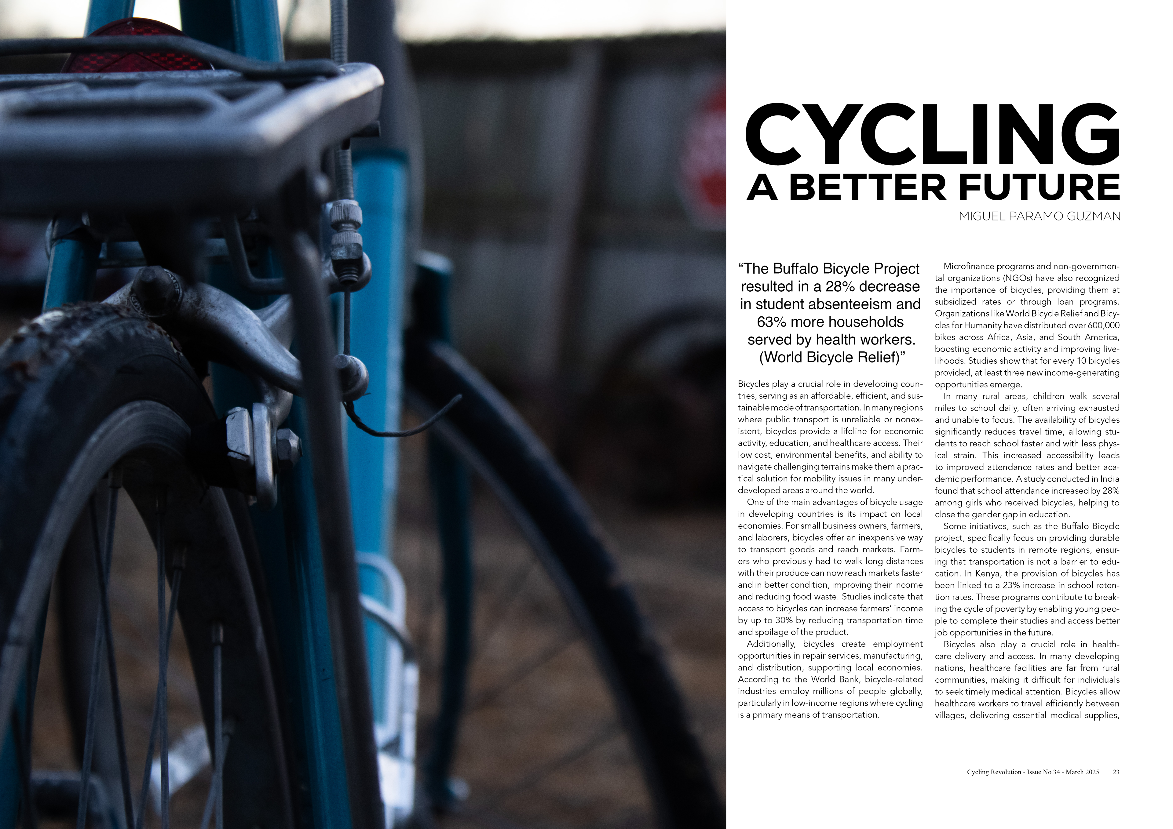
This project consisted of designing a magazine spread that raises awareness about the impact of bicycles in developing countries and low-income communities within the United States. For the title, I chose the sans-serif typeface Nexa Heavy, which conveys a sense of formality appropriate for the seriousness of the topic while also reflecting a common typeface style found in bicycle branding. The featured imagery centers on an older bicycle equipped with a rear rack—a practical and commonly used bike for commuting to work, school, and other essential destinations. The rack highlights the bike’s role in transporting cargo, while the use of an older model reflects the economic reality that, much like buying used cars, individuals in low-income areas often rely on secondhand bikes due to affordability. For the body text, I selected Avenir in a lighter weight to ensure readability and to maintain a clear visual hierarchy without overpowering other elements on the page.