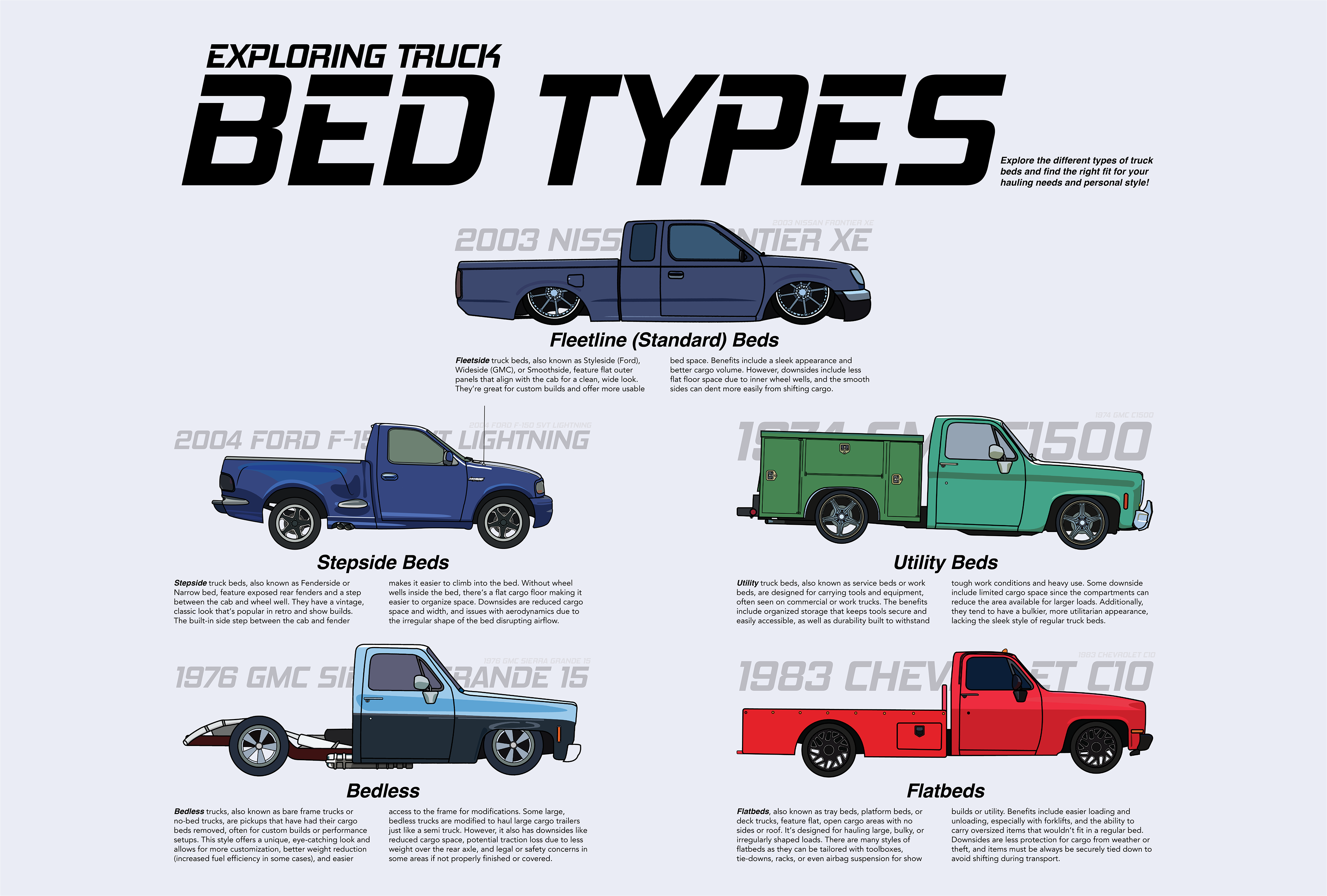
The challenge was to design a poster showcasing different truck bed types to help clients select the option best suited to their needs. Each section included a brief description along with key benefits and drawbacks of each bed style. Since this poster was created for the same client as a previous project, the visual style was kept consistent. For the title, I used the Hemi Head typeface, chosen for its strong automotive association and bold presence, making it ideal for vehicle-related headings. Section headers were set in a bold typeface to establish hierarchy, while the body text used a lighter typeface to ensure readability. The names of the truck bed types were placed behind each illustration at reduced opacity to avoid overwhelming the visuals. To improve legibility, especially where the illustrations made the background text harder to read, the names were also included again in a smaller, clearer font nearby.