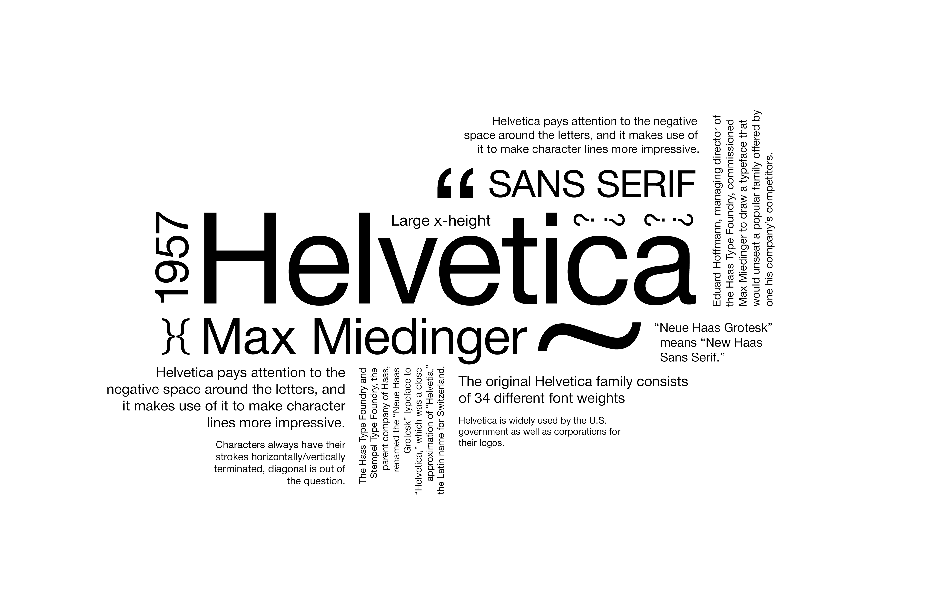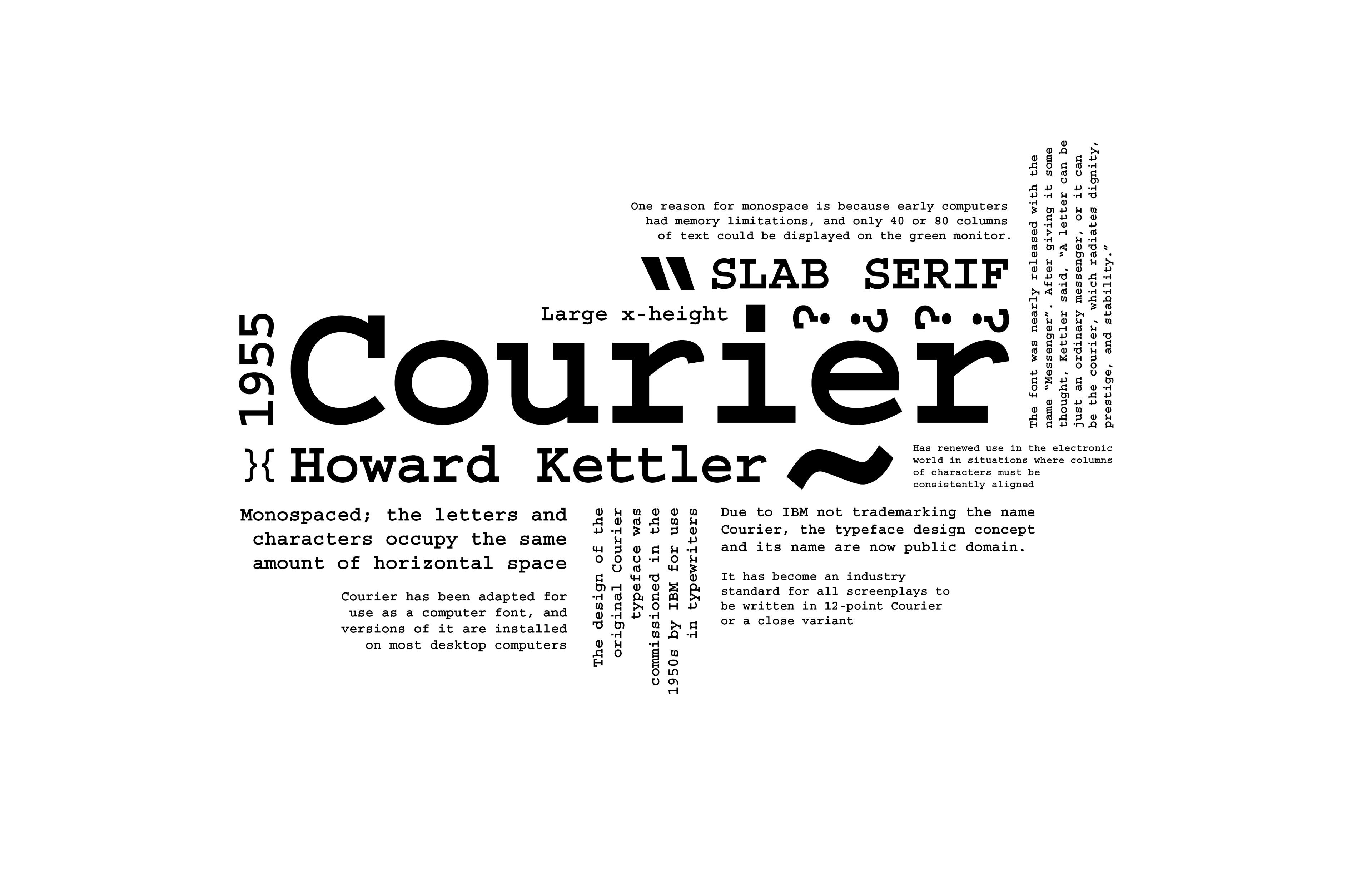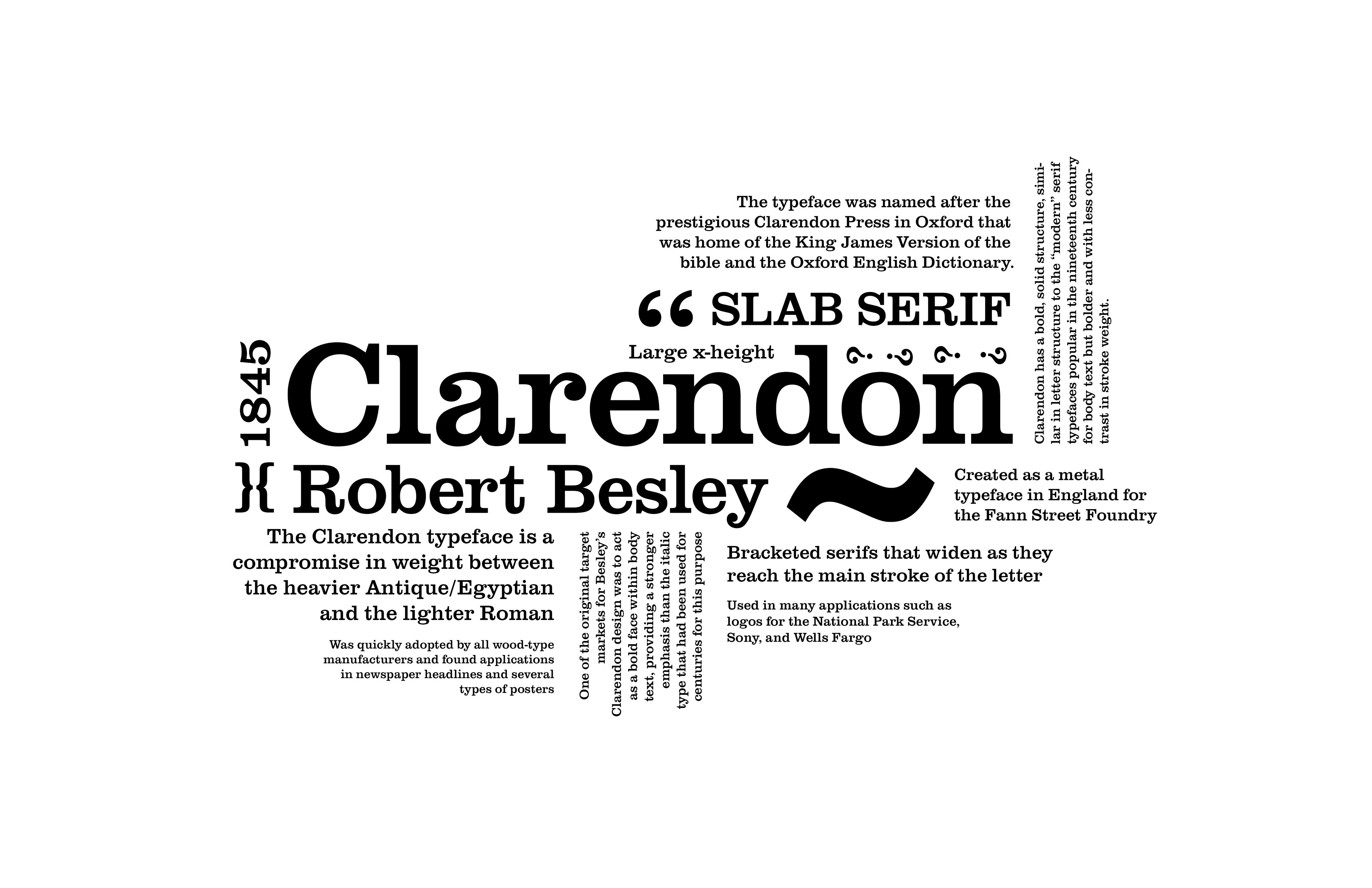
The challenge was to design a series of typographic posters, each featuring a different typeface: Helvetica, Clarendon, and Courier. The solution was to create three posters with a consistent layout, maintaining visual unity by using the same glyphs (", ~) across all designs. Instead of a traditional block of text, the layout was arranged to form a distinctive, dynamic shape, giving each poster a unique visual identity. Informational text about each typeface was embedded within the composition, allowing viewers to not only appreciate the visual characteristics of the fonts but also learn about their history and significance. This approach balanced aesthetic appeal with educational value.